


Foes describes themselves as “operating partners tasked with building and scaling revenue generating activities for SMBs”. So right from the start you know they’re not your garden variety new agency. Especially when their brand purpose as powerful as theirs: We exist to challenge the status quo. To battle the mediocracy that exists in professional services.
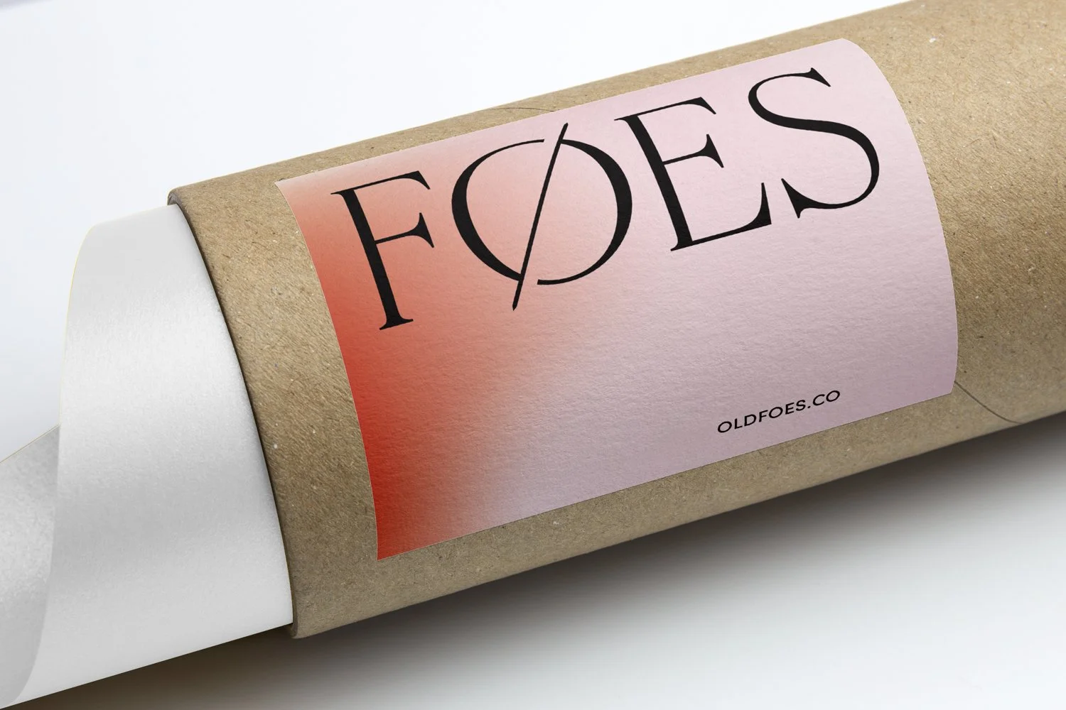
Awake created a symbol within the wordmark that is pierced by a dagger-like shape to reference the old-world nature of the word Foes. But what that dagger creates is akin to a digital “0” rooting the agency securely in the present. The symbol, with the notches taken out of the letterform, creates a sense of forward motion (even perpetual motion) that gives the wordmark a dynamic feel.