New Standard
Brand Identity
Packaging Design
Collateral Design
2018
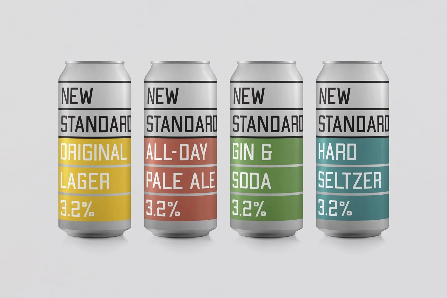
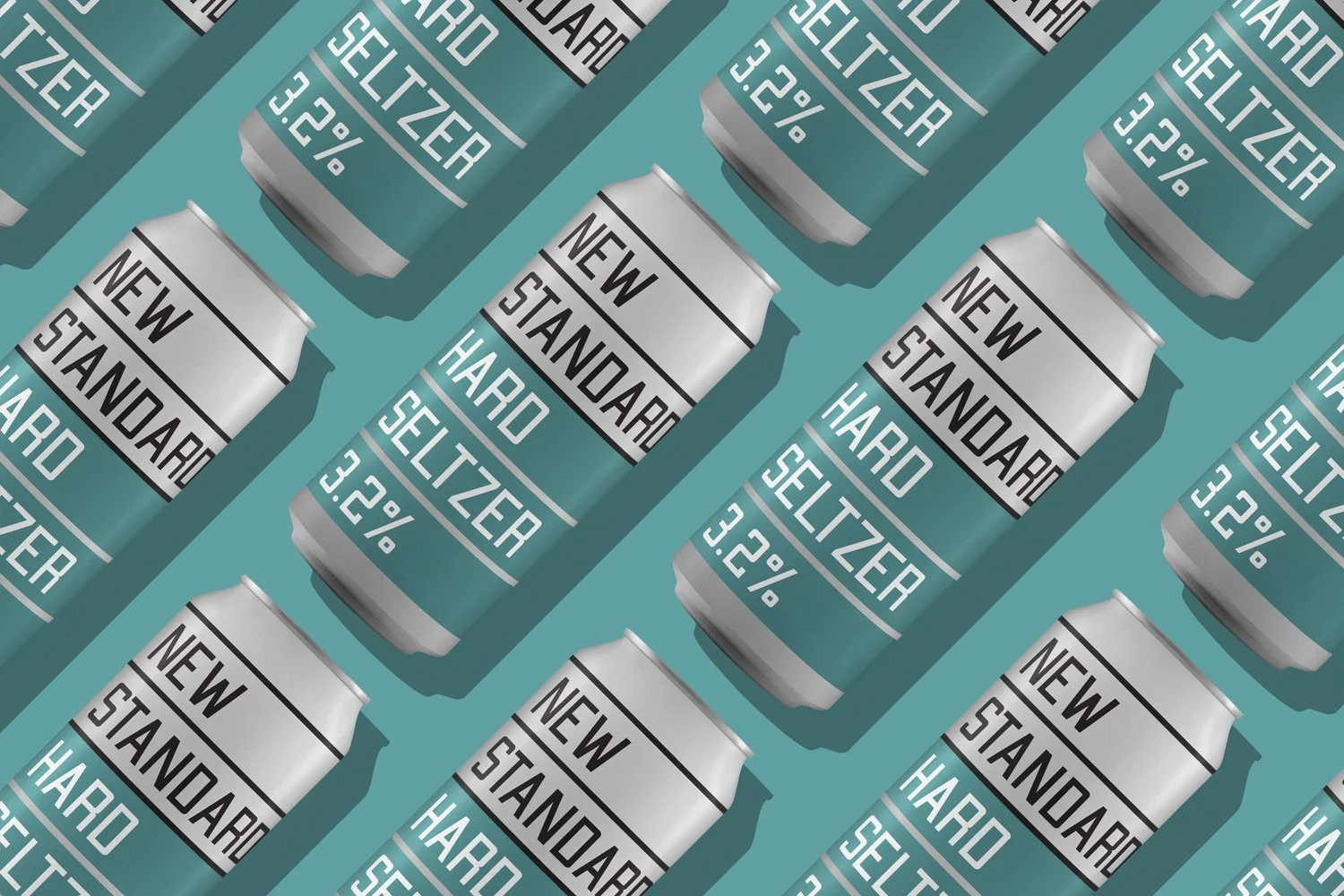
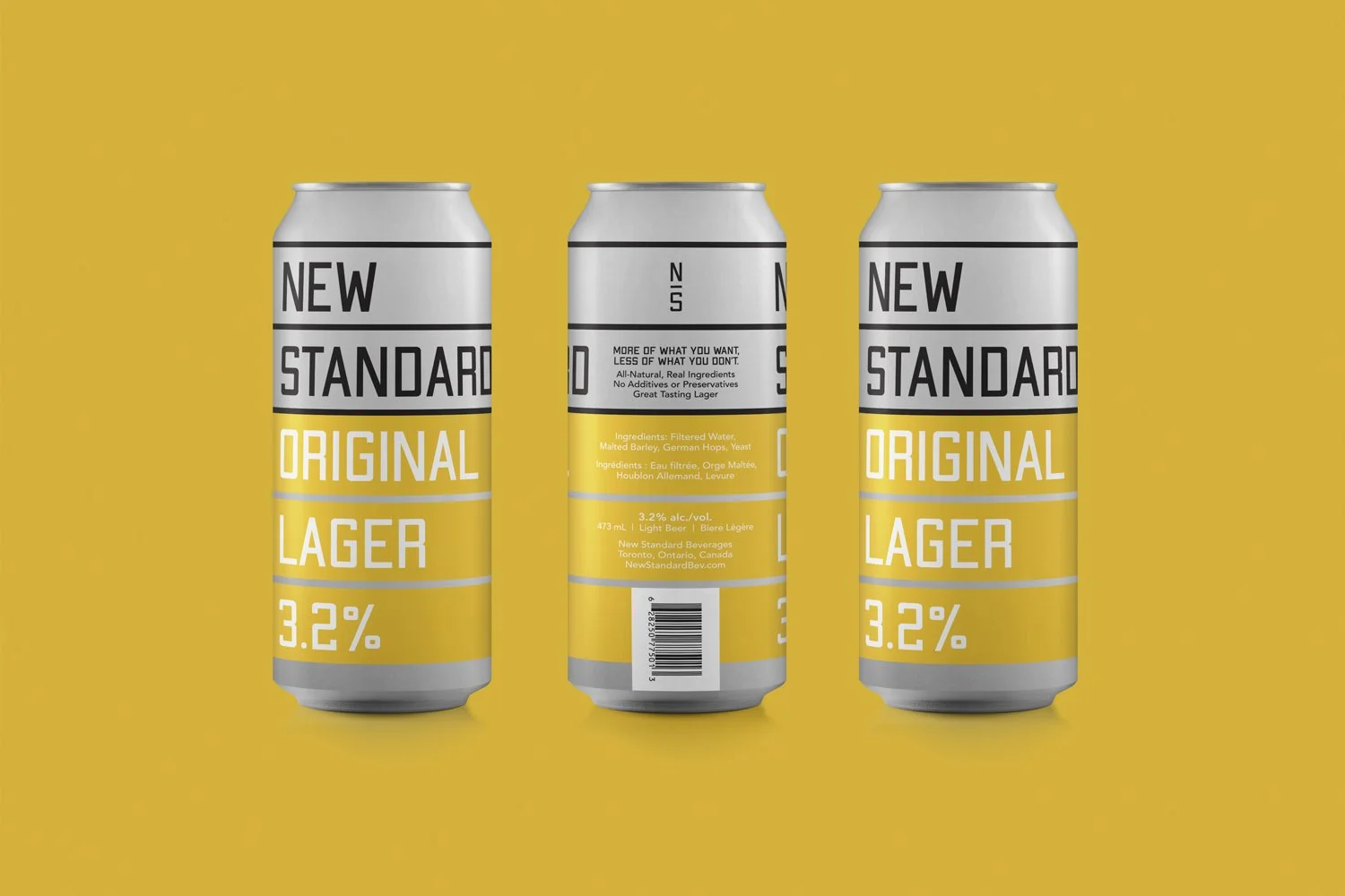
New Standard is an Ontario beer that boasts a reduced alcohol count but with (wait for it)...actual delicious and fulfilling taste. Dave Martin, the founder of New Standard, recognized a distinct hole in this market where most low-alcohol beers have a stigma about being watery and flavourless (and mostly for good reason). He worked with top-notch brewmasters to create a beer that will make consumers forget that they're not drinking a regular alcohol beverage.
The proposed target skews male, and with this target there is still a bit of a stigma against ordering a low-alcohol beverage. For this reason the packaging was scaled back to its basic elements, with a hint of sports team design peaking in to assure our beer drinker that it's socially acceptable to crack a cold one with a bit less punch. Martin was also keen to convey the relative benefits of choosing low-alcohol and the graphic underlines give a nod to the line-driven design on ubiquitous nutritional labels.The identity was inspired by the mix of new and old that will be on offer in the shop (as well as this mix of eras that characterize the town itself). A classic sans serif is paired with a more decorative serif as the foundation of the identity – all contained within a distinctive oval loop (the “loop” is the name of the popular tourist route around the centre of the town).
-
![]()
01
-
![]()
02
-
![]()
03
-
![]()
04
-
![]()
05
-
![]()
06
-
![]()
07