Belmonte Raw
Brand Identity
Brand Guidelines
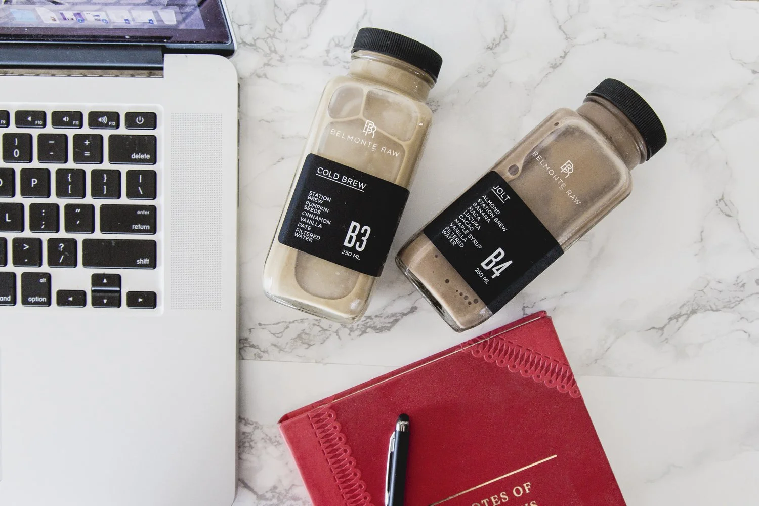
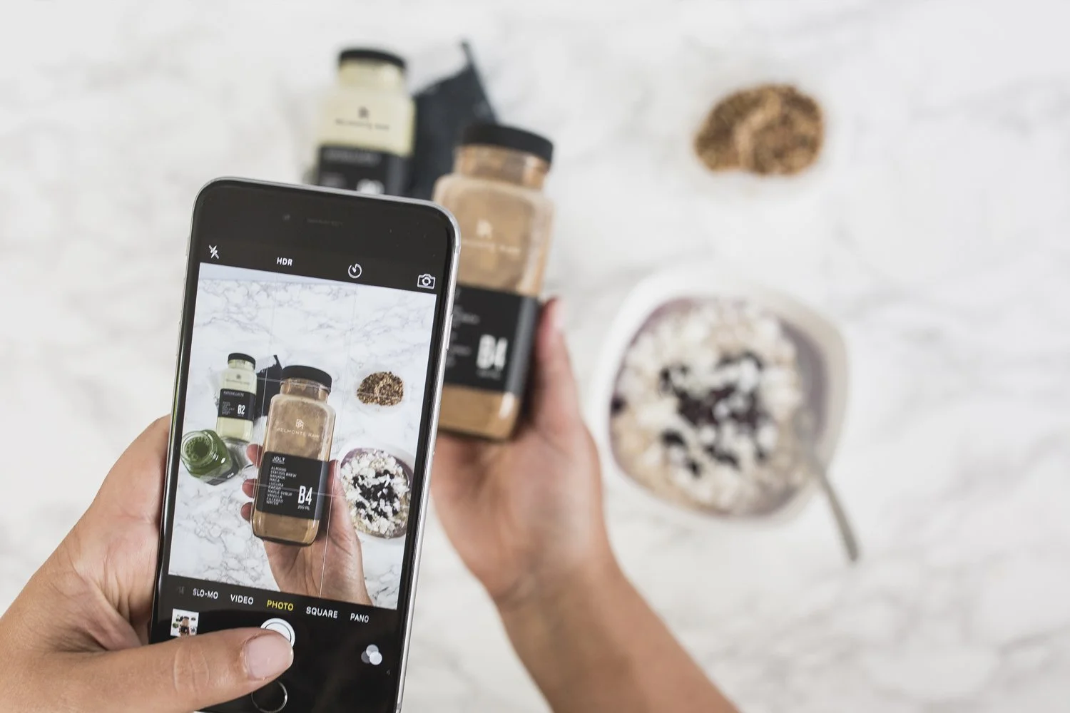
Packaging Design
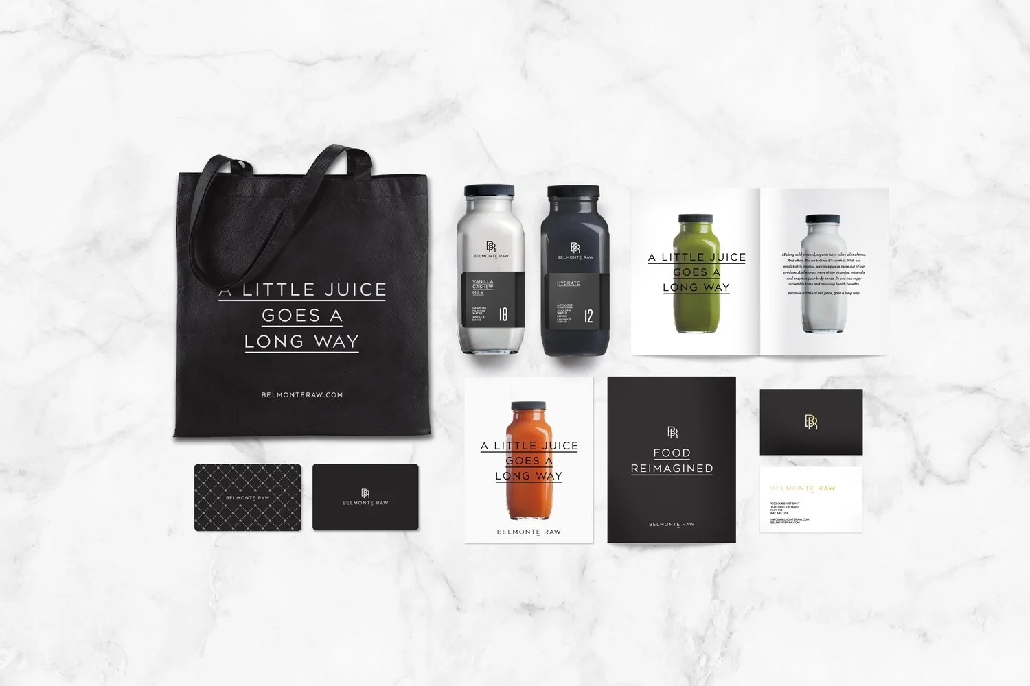
Collateral
2014
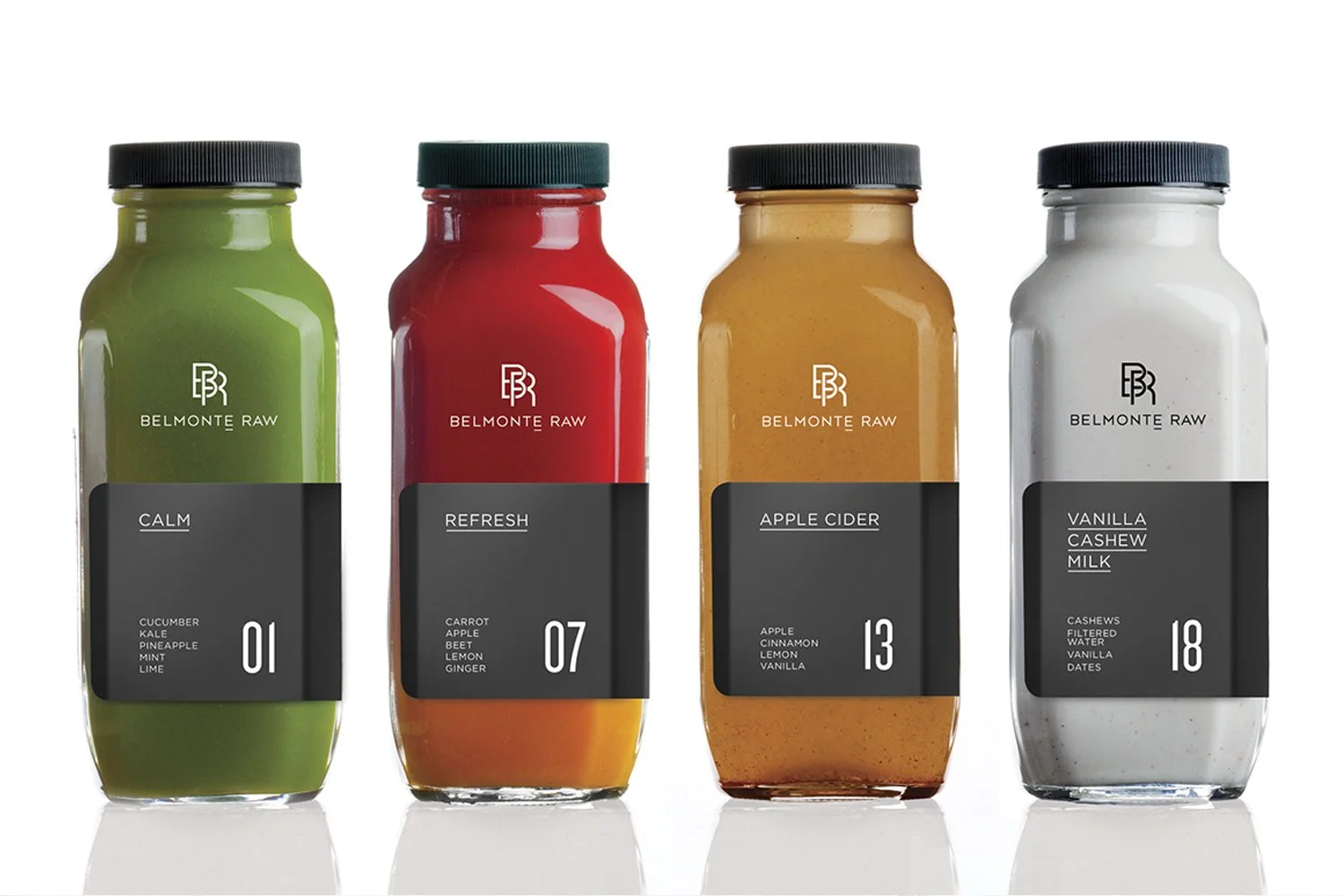
Years ago Carol Belmonte launched Belmonte Raw by bringing salads via bicycle to hungry office workers. At the time of their inception there were no organic places offering what Belmonte Raw was creating. Carol recognized this need and it struck a chord with customers, so much so that many of those original clients remained loyal to Belmonte Raw, still picking up salads, juices, nut milks and smoothies as the brand continued to grow.
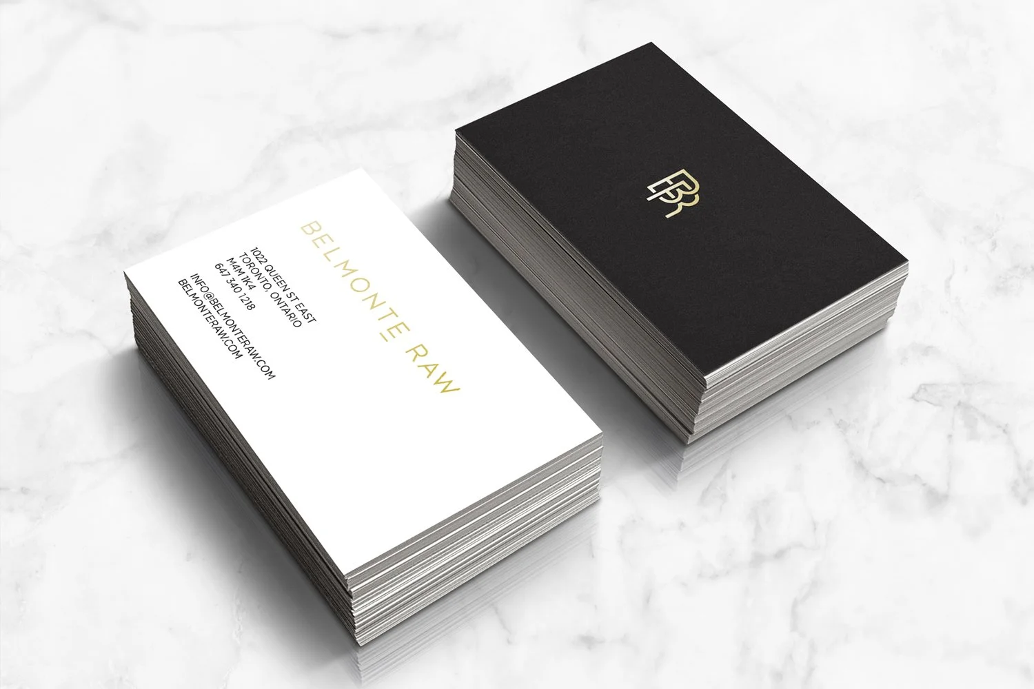
Alongside that growth, a new brand identity was required - one that was more in sync with the new direction of Belmonte Raw. A more premium identity was created to differentiate from all the playful juice branding in the marketplace. A paired down palette allowed the colour of the food to shine and communications were lead by brand statements that brought the product to life. The underline below the "E" in Belmonte was included since most people don't pronounce it and instead keep it silent. This was a source of frustration so the underline was created as a tool for brand enlightenment.
Photo credits: The Bennett Studio, Acquired Taste, Lisa Perole
-
![An image of the Cultural Center.]()
01
-
![An image of the Cultural Center.]()
02
-
![]()
03
-
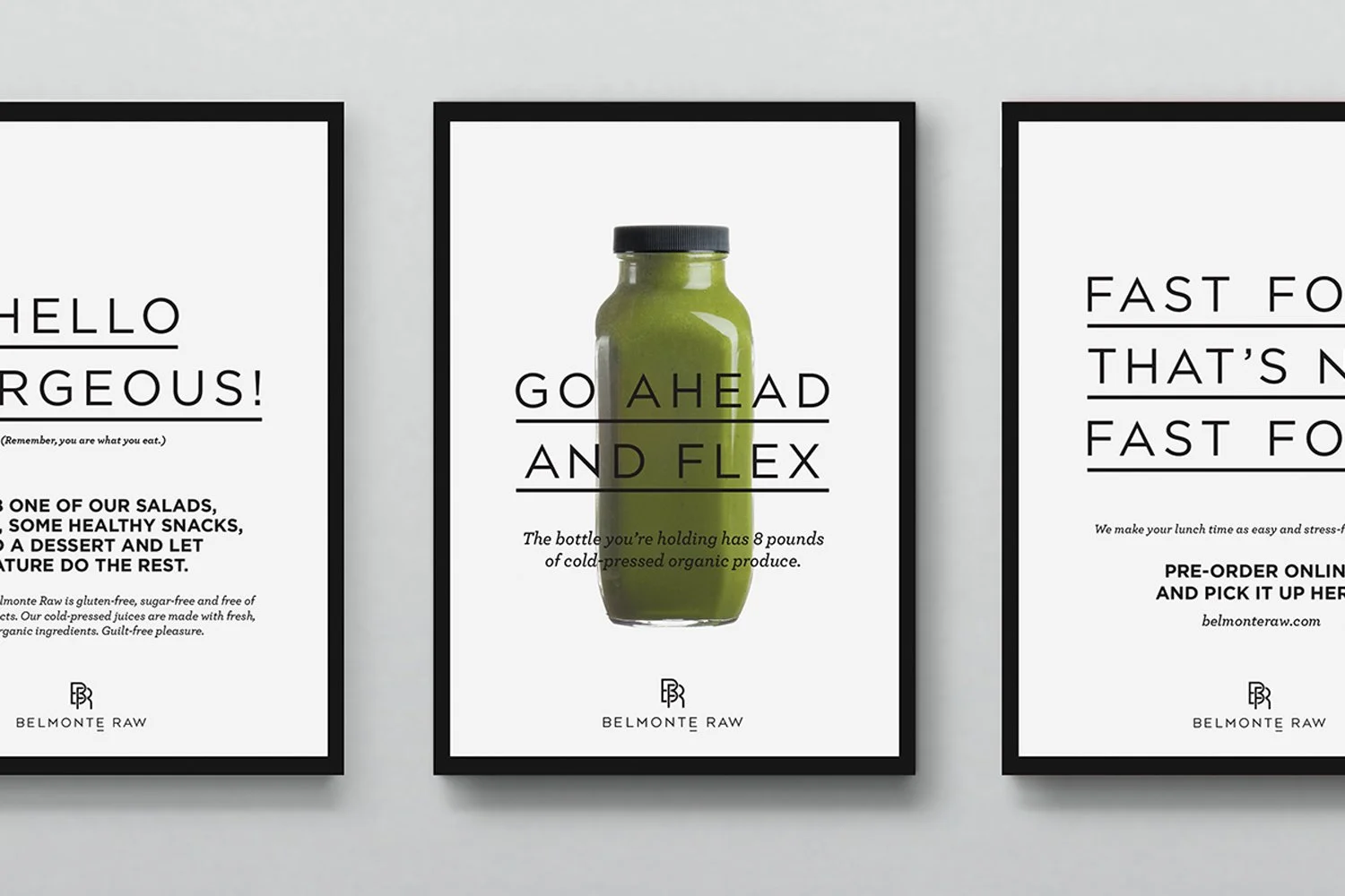
![Three framed posters promoting Belmonte Raw juice brand. The middle poster features a green juice bottle with the text 'Go Ahead and Flex,' and details about organic produce. The left and right posters contain promotional messages and brand information.]()
04
-
![A stack of black cards with white dashed lines and small diamond symbols, labeled 'BELMONT RAW,' on a white marble surface.]()
05
-
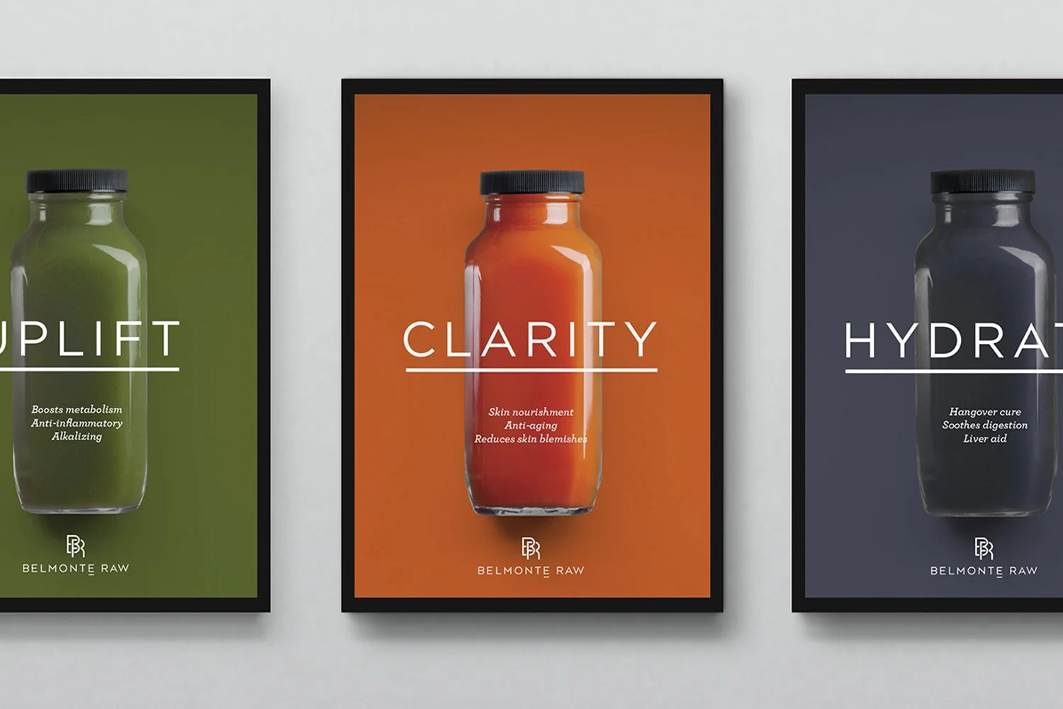
![Three framed posters each featuring a bottle of a wellness supplement with a different color background: green, orange, and blue. The posters are labeled 'Uplift,' 'Clarity,' and 'Hydrate,' with descriptions beneath each and the brand 'Belmonte Raw' at the bottom.]()
06
-
![Close-up of blueberry lavender tartelette desserts in edible tart shells with purple filling, displayed on a tray in a bakery, along with a white sign describing ingredients and price.]()
07
-
![Interior of a juice and raw food shop with a black wall and shelves displaying juice bottles and packed snacks, with black and white patterned flooring.]()
08


-
![An image of the Cultural Center.]()
01
-
![An image of the Cultural Center.]()
02
-
![]()
03
-
![Person taking a photo of various health supplements and bowls of smoothie ingredients on a white marble surface with a smartphone camera.]()
04